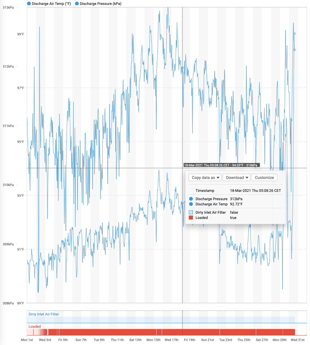
Back in 2021, I was faced with a challenge in work; build a react component to show numeric, boolean and string timeseries data on a single chart.
Inspiration
We use a proprietary software system called Skyspark as our time series database.
In addition to being a performant store, it also has some fantastic visualisation features built in, including charts with different types of data.
One such example is shown below:

This is essentially what I was looking to recreate as a react component, with a simple interface (props) which accepts any combination of time series data.
Highcharts
We use Highcharts for our visualisations, so it was the natural starting point. I referred to their documentation, assuming that this was a common enough use case, but unfortunately I was wrong.
I ended up posting about it on their forum and after a number of back and forths, landed on a solution which leverages their X-Range series.
At the time of writing, the post had been viewed almost 2,000 times and the code sandbox had been forked over 20 times. It seems we aren't the only ones with this problem!
Our <DateTimeChart /> Component
Using the Skyspark chart as inspiration, I built a new <DateTimeChart/> component which renders numeric data on top and boolean data below.
When building presentational components, I use Storybook so that I can build it in isolation. As you can imagine, there are plenty of edge cases to work through, so having each covered by its own story proved very useful. One such story is shown below, with three numeric and three boolean series on a single chart:
With the component handling numeric and boolean values, it was relatively straightforward to extend it to handle string values.
In our domain, the most common occurrence of string values in time series data is for discrete states of machinery or equipment.
For example, a heavy piece of machinery may be "OFF", "STARTING_UP", "RUNNING", "IDLE" or "SHUTTING_DOWN".
The biggest challenge for the inclusion of string values was to determine what colours to use for the series. For numeric values, the user picks a single colour for the series. For boolean values, the user picks a single colour for the true values and the system uses the same colour with a greater opacity for the false values. For string data, the user picks a base colour and the system has to come up with a palette of colours to use, one for each unique value.
In theory, we could have an infinite count of unique values.
In practice, we've found that having 10 colours in our palette is sufficient for our use cases.
With this constraint in place, we pulled in a third party library that given any colour, would produce a palete of n similar colours.
An example of numeric, boolean and string data on a single chart is shown below:
This component has undergone numerous tweaks and improvements since it was first developed, yet its underlying approach hasn't changed.
It has been one of our core components for years now, empowering our customers and subject matter experts to uncover carbon and cost savings and help achieve our decarbonisation goals!
